When the pandemic hit Aotearoa, most museums were closing their doors, but one group wanted to do the opposite. The Medical Museum Trust approached The Letter Q, and we worked together to give shape to the possibilities for the a new online museum of medical heritage. All this at a time when the phrase ‘social distancing’ was contributing to the challenge. Quickly, we discovered that the right brand identity could sustain a new kind of museum; not the conventional bricks-and-mortar scenario, but an open digital space for our shared memories of medical science.
The right brand would support stories of extraordinary Kiwis, from the eminent to the everyday so we needed a tone of voice perfect for storytelling in this dedicated digital space. Here was an opportunity to bring a contemporary and vibrant voice to medical heritage in Aotearoa in a way that had not been done before.
Research helped reveal how to visually articulate the idea of an e-museum within the wider cultural landscape. A carefully crafted brandmark emerged from a simple motivation: to communicate the concept of a continuing living force. A potential starting point was the infinity symbol. However, in considering the concept, we also thought of life-giving shapes such as a breathing mouth or the sound of a Pūtōrino (flute). A process of refinement then gave the mark its bold but crafted presence.
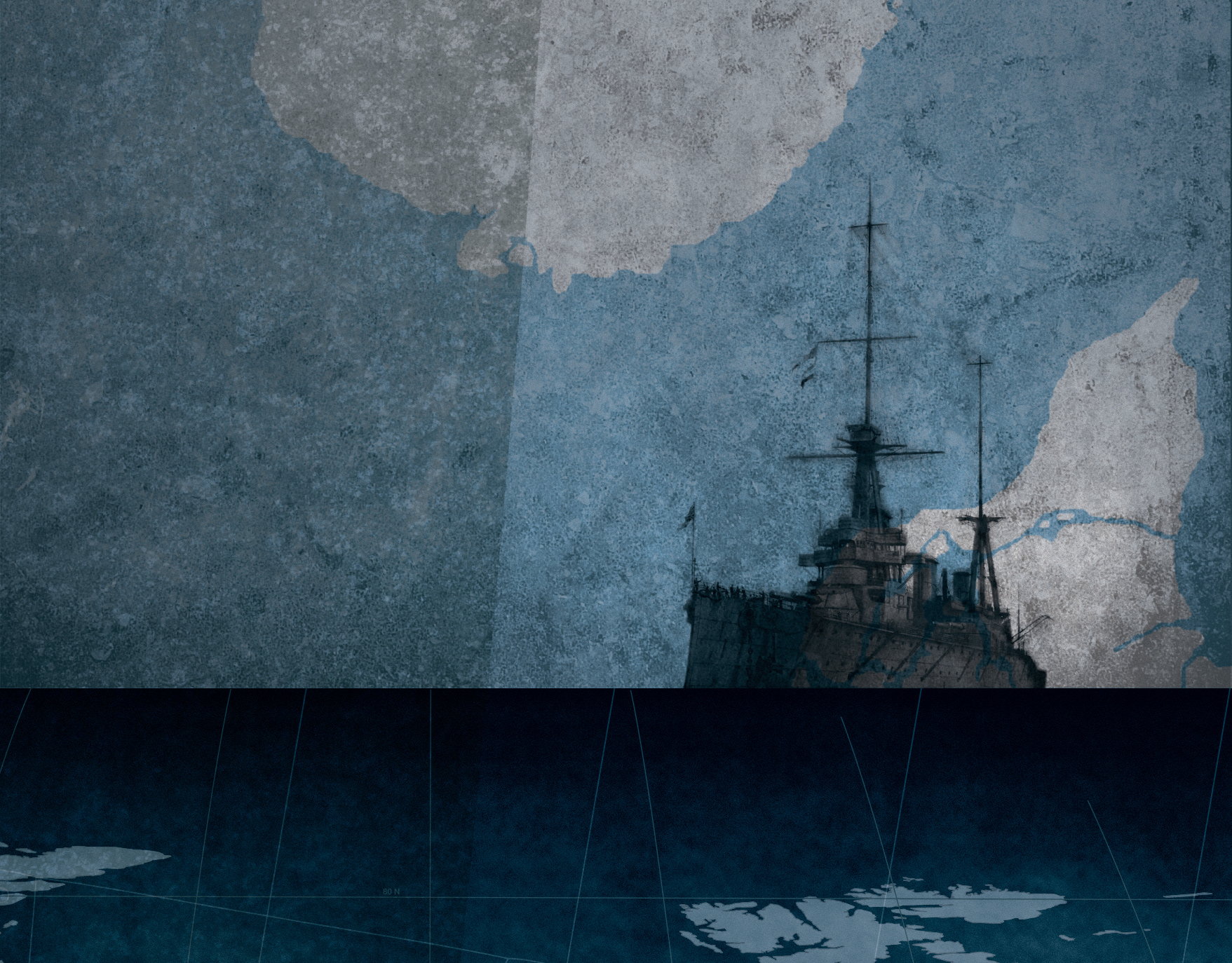
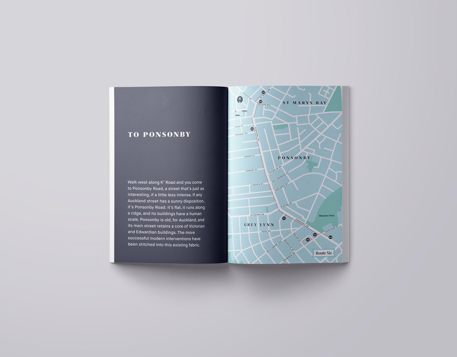
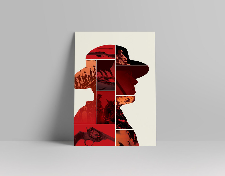
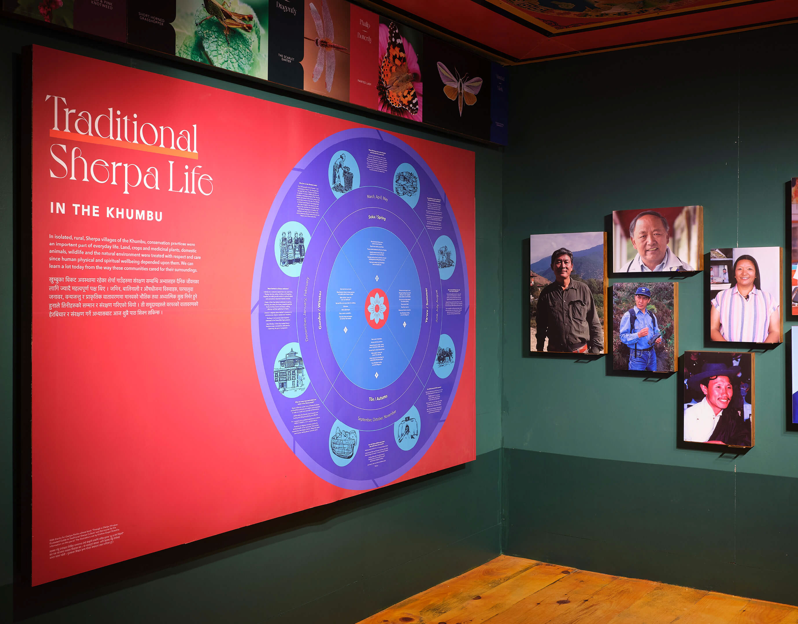
But a logo needs to be part of a much wider range of communication tools to generate a brand of substance. In this case, a clearly defined tone of voice, color palette, and typographic approach were supported by image treatments suitable for stories of cutting-edge scientific endeavor as well as our unique shared heritage. The name ‘Our Health’ was emerging as more than just an online museum; it was a guide through both memory and aspiration. By producing detailed visual standards for the brand, we demonstrated how it could retain consistency while the subject matter shifted from one topic to the next.
As carefully curated stories were added to the website and memories were shared on social media, further associations accrued around the brand further supporting its growth. This process continues online, showcasing how experiences and authentic meaning can bring a brand to life. As the community grows around this project, feedback continues to be very positive and the potential unlimited. The identity design is creating the right space for this citizen-curated project. Working in his capacity as Art Director at The Letter Q, Nick has designed the brand, the website and continues to guide the design of new projects within this exciting new e-museum.
